The Power of Color
Going beyond. Taking it to the next level. Finding those little tweaks that can take an image from nice to NICE!
In the words of photographer Anthony Nex: Subtle adjustments—like changing a background color—can sometimes have a profound impact on the overall composition, transforming a good image into something truly striking.
Sometimes all it takes is paying attention to the little things. Lighting, Composition, Detail all play an important part in the impact of an image. But if the big cinema movies teach us anything it’s that quite often Color has the biggest impact.
When working on the image above for Anthony Nex his instructions were to composite the plates shown below into one seamless shot.
Pretty cool shot, eh?
But in taking another look, going a little deeper we decided to look at how the color harmony in the image was working.
This is where Photoshop’s Color palette window comes in. Most of the time that window looks like this:
While viewing colors like this can be useful it is tough to see how various colors might relate to each other. But if you click on the 3 lines in the upper right corner you’ll see there are options for different models you can use in this palette. (I could not get a screen grab of pop out menu…) Choosing Color Wheel gives you this view:
As you can see this view lets you see the Hue, Saturation, and Brightness sliders on top and the Color Wheel below that. When you sample a color using the eyedropper tool you can see not only the HSB numbers, but where that color lies on the Hue Wheel as well.
While Adobe does not let you see more than one color on this at a time, (I still mourn the loss of the Adobe Color Themes Extension), by sampling different colors we can get an idea of how these all relate to each other. And that leads us to thinking about Color Harmonies.
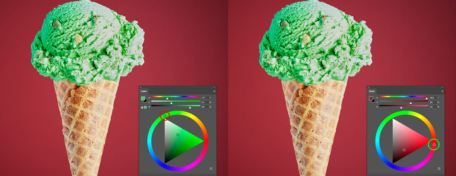
In other articles I’ve written I’ve discussed various Color Harmonies, (here is a link to a primer on Color Harmonies), so I’ll not go too deep on those now. In this case I wanted to see how the important colors in the image, the green of the ice cream and the red of the background related to each other. Here you can see how I used this Color Wheel to see how the green and the red related to each other:
Notice how the green and the red are sorta 1/3 of the way from each other on the color wheel. If we had something blue in the image we could work to get a triad color harmony going in the image where each of the important colors land about 1/3 of the way from each other.
But since we just have 2 important colors perhaps a complimentary color harmony, where the important colors are more or less on opposite sides of the color wheel, would really work well.
Once we have an idea for how we’d want the colors to relate it’s simply a matter of adjusting one of those important colors to move it in the direction needed.
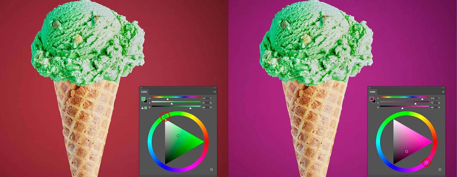
Looking at the color wheel we can see that the complimentary hue for the green of the ice cream is more in the purples than in the reds. So what if we shift the red background more in that direction?
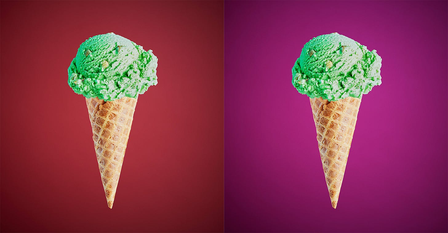
Shifting the red background is mostly a matter of adding blue and maybe taking some green out. Making that tweak gives us this look:
See how such a simple move changes the impact of the image?
Here is a side by side comparison showing how the purple relates to the green on our color wheel:
And just in case you’re interested in knowing how I shifted the color on the background all it took was adding a Curves Adjustment Layer positioned just above the background layer in the Layers palette. Then I set the Blending Mode for that layer to Color Blending, (for more info on this concept here is a link to my article outlining the Divide & Conquer Color Correction technique).
With that set up all I had to do was add some Blue, then take out some Green (to push the color more in the Magenta side of Purple). Below is a screen grab giving you an idea of what those Curves looked like.
The point here is that quite often all it takes is going a little beyond finding those simple moves that can raise the impact of an image such as taking a quick look at how the colors relate to each other.
To sum it up here is a testimonial from Anthony Nex:
You know you’ve found the right retoucher to work with when they not only help you attain your vision for an image, but take it beyond what you had imagined. I’ve worked with Dennis for over 20 years, and this shot is a classic case of that. We had a background that worked, but when he sent me his suggestion for subtly changing that color we were blown away.. Subtle adjustments—like changing a background color—can sometimes have a profound impact on the overall composition, transforming a good image into something truly striking, and this is what Dennis achieves on a regular basis.








Nice work Dennis!