

Divide & Conquer
Your Quick Guide to "Divide & Conquer" Color Correction in Photoshop

Here’s an article about a Color Correction technique I call "Divide and Conquer" which makes color correction in Photoshop much easier. By using two Curves Adjustment Layers, one set to Luminosity Blending for managing light/dark aspects, and the other set to Color Blending for managing color, you can tackle these two challenges separately. And guess what? It even gives you the power to control saturation with the Color Blending layer.
Divide & Conquer: Color Correction
By Dennis Dunbar
In retouching, as with anything, some things are easier said than done. In the world of retouching color correction ranks up near the top of this list for most folks. Whether you’re a beginner, or a seasoned user knowing what to correct and how can be a challenge.
Part of the problem stems from the fact that as you adjust one thing something unwanted can happen at the same time.
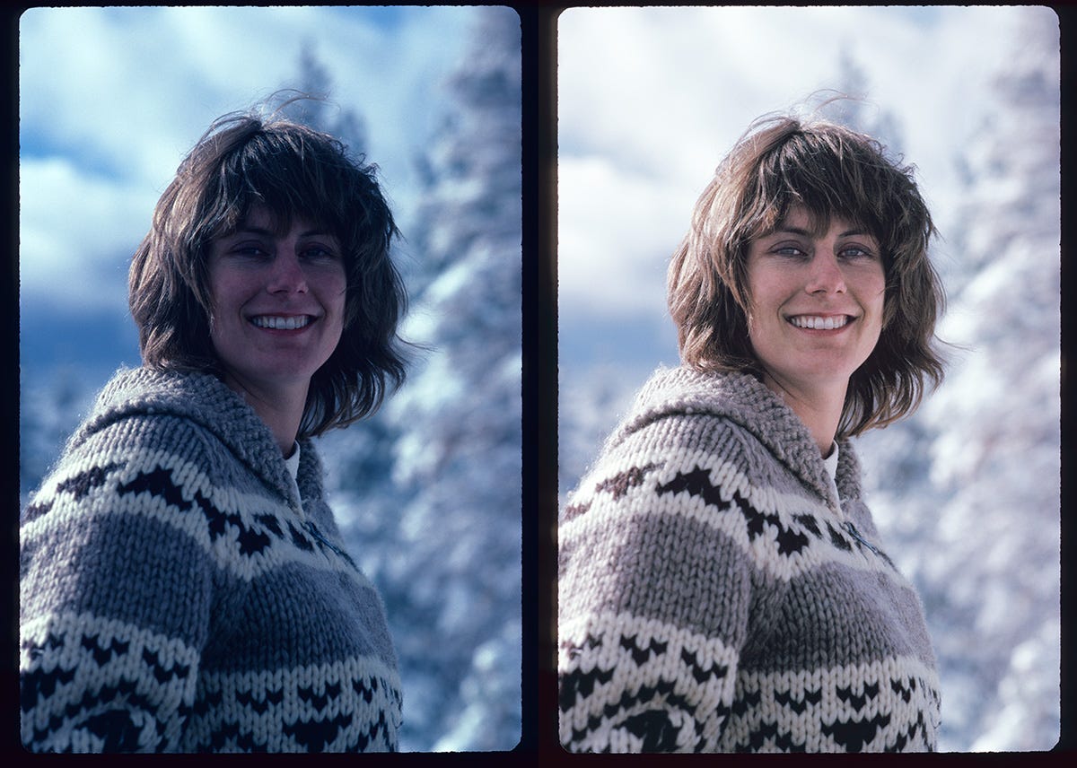
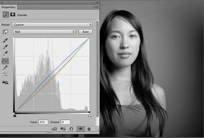
For instance take the image below:
As you can see this image is little bit dark. Just to make the example obvious I’ve added a Curves Adjustment Layer to this image that’s pretty extreme to lighten it up.
Notice how the image not only gets brighter, but now it’s got a strong Yellow cast to it as well? What happens if we darken it?
Now the image has not only become darker, it’s picked up a strong Red cast to it as well.
This happens no matter which adjustment tool you’re using whether it’s Curves, Levels, Brightness/Contrast or Exposure. And the problem seems to lie in the math that’s going on under the hood.
Global changes made in any of these Adjustment tools also affects the Hue and Saturation of the image.
Of course this means you’ve gotta go run around the proverbial Mulberry Bush adjusting this Channel or that one until you get the adjustment just right.
No wonder it’s such challenging task!
But what if you could divide the challenge so you’re dealing with just the lightness/darkness (tonality) or the color separately without one affecting the other?
One possible way to do this would be to convert your image to the Lab color space and do the color correction there.
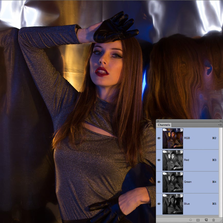
While the Lab color space (or LAB as some call it) can be very powerful it’s also not very intuitive. Just to take a quick look at how this color space works here’s a shot showing the same image in both RGB and Lab. The small inset on the lower right shows the thumbnails of the various Channels in the image.
As you can see the RGB channels in the image on top each have color and tonality, they’re pretty much self explanatory.
But the Lab channels in the image below look quite different and require some explaining before the average user can understand what’s going on.
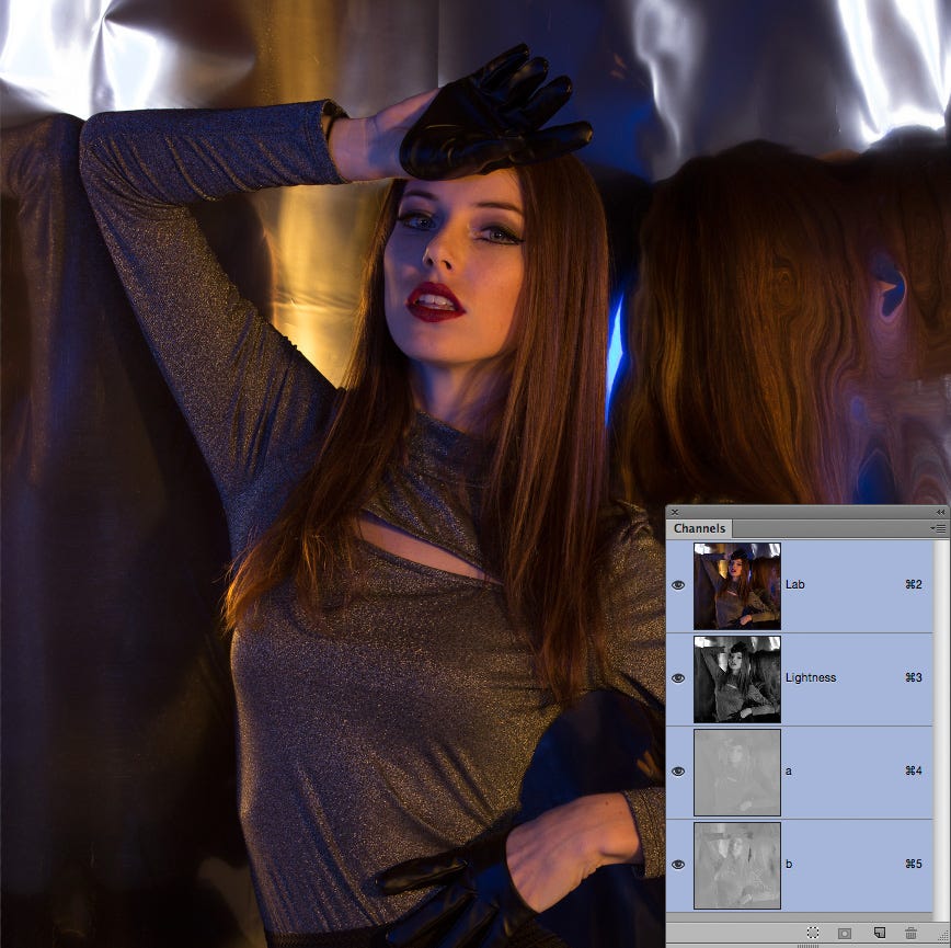
The Lightness Channel has all the information for the tonality while the a & b Channels divide up the color information with the “a” Channel having all the Green/Magenta information and the “b” Channel all the Blue/Yellow information.
While this solves our immediate problem of separating the tonality from the color it makes figuring out how to adjust the color much more complicated.
But suppose we take a hint from this color space and adapt it to something that can work with either RGB or CMYK?
Enter the Divide & Conquer technique!
Simply put this technique combines the power of Photoshop’s Blending Modes with 2 Curves Adjustment Layers to solve our problem.
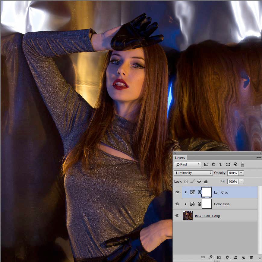
As you can see from the inset this image now has 2 Curves Adjustment Layers, one named Lum Crvs and the other named Color Crvs.
The Lum Crvs Adjustment Layer is set to Luminosity Blending, and the Color Crvs Adjustment Layer is set to Color Blending neatly dividing our challenge into 2 smaller, easier to handle challenges.
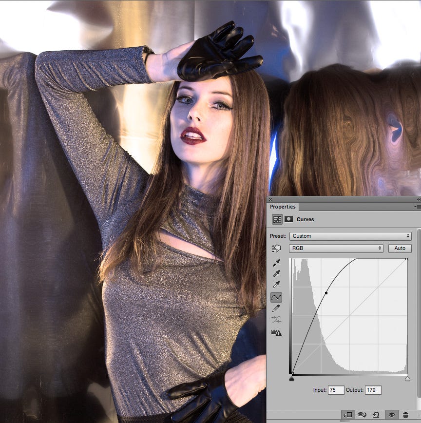
Now if we make an extreme move like we did with the first example to push the brightness of the image we get a result that looks much more like we’d expect. As you can see the image is lighter without any apparent change to the color.
Simpler, eh?
Here’s an example with an adjustment we’re more likely to make. This time not only have we lightened the face, but we’ve added a touch of contrast in the shadows as well.
Side note: This is one reason why I prefer Curves over Levels, this move would not be possible with just the 3 controls Levels gives you.
Now that we’ve covered how the Luminosity Layer works let’s take a look at how the Color Layer works.
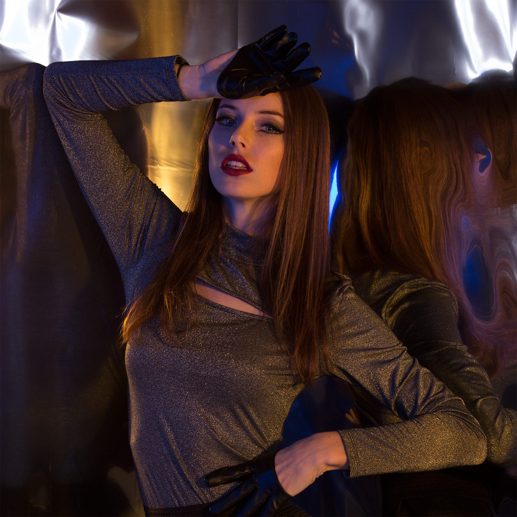
Here’s a shot that has some serious color cast issues as well as a being a little bit dark.
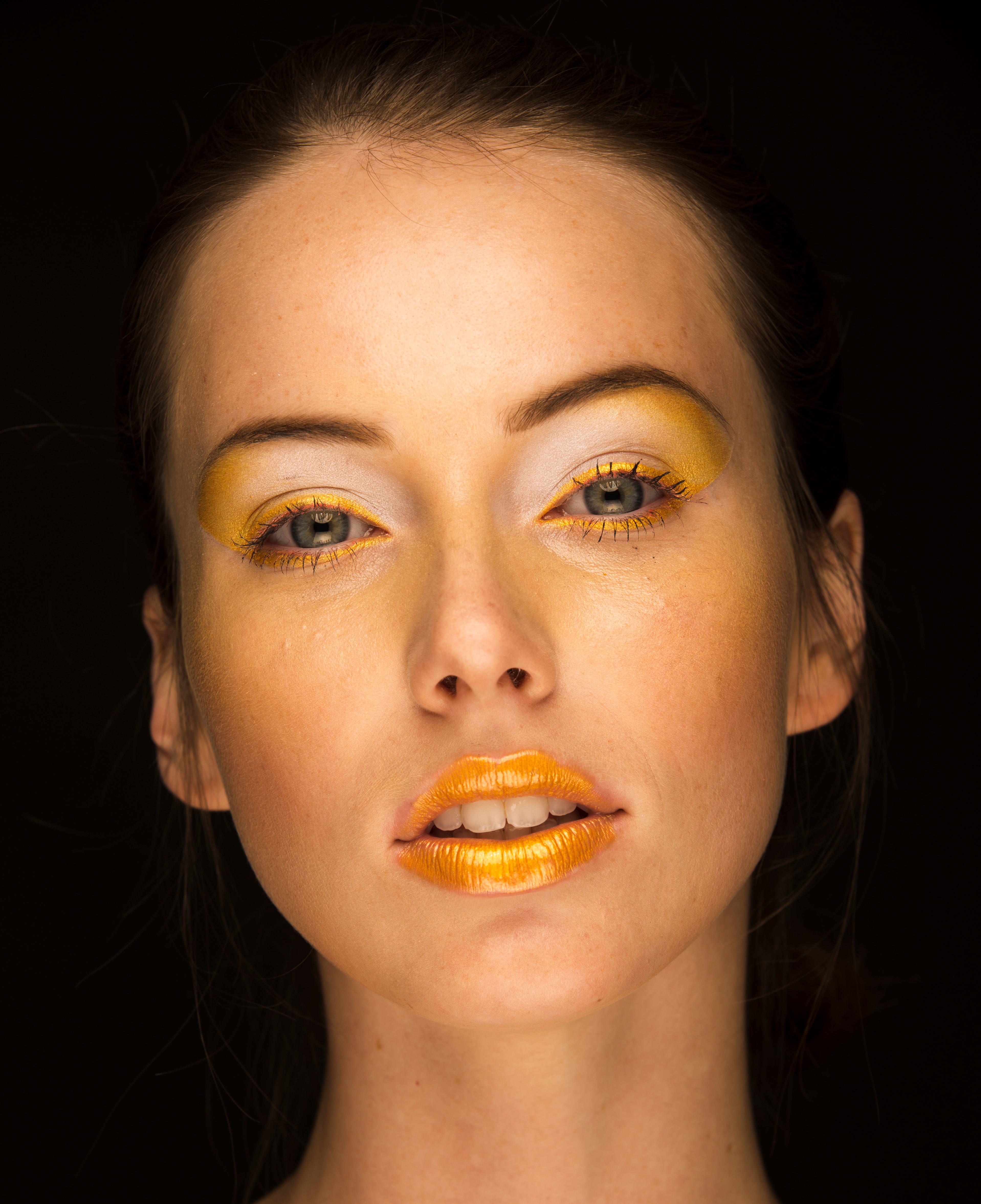
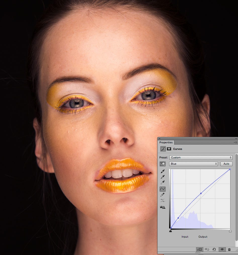
The first issue that appears here is the overall Yellow color cast plaguing the image. So let’s begin by opening the Color Crvs Adjustment Layer. Since Blue is the opposite of Yellow we can attack the color cast by adding Blue.
To do this we choose Blue from the drop down Channel menu. Using the Finger Tool to find where the values in this image fall on the Blue Curve we place a point near the mid-point and bump it up until the majority of the color cast is taken care of. Adding an additional point just below the ¾ tones allows us to bump up the Blue there to help pull a little more Yellow cast in the shadows.
The next step logically would be to address the darkness in the shadows. As you might have guessed we can attack this problem by opening up the Lum Crvs Adjustment Layer.
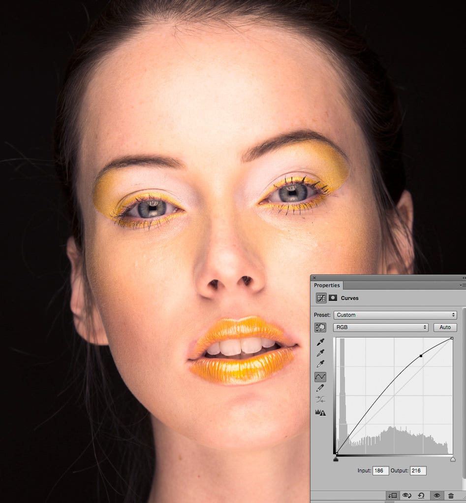
Here we can correct the darkness of the image by simply clicking on the RGB Master Curve on a point about 1/4 of the way from the White Point in the upper right corner and pulling up until we’re happy with the result. (And again this is an adjustment you just can’t do in a Levels Adjustment Layer.)
By dividing up the problem into two smaller challenges we were able to arrive at a reasonable color adjustment quickly and easily.
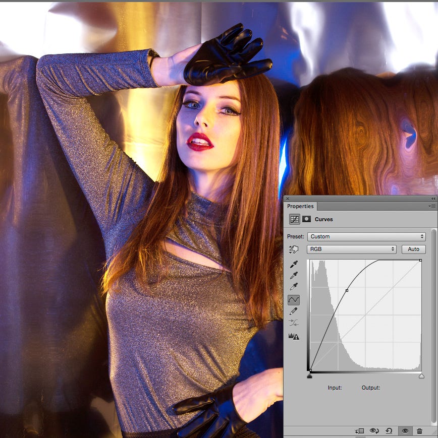
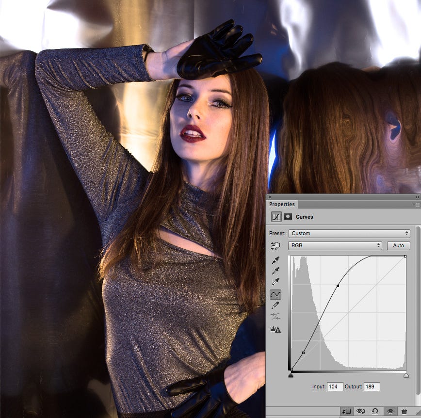
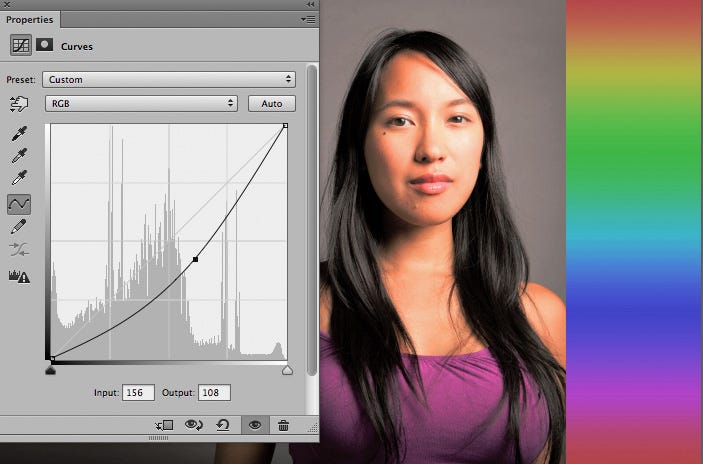
To further explore the power of this technique let’s take a look at another image.
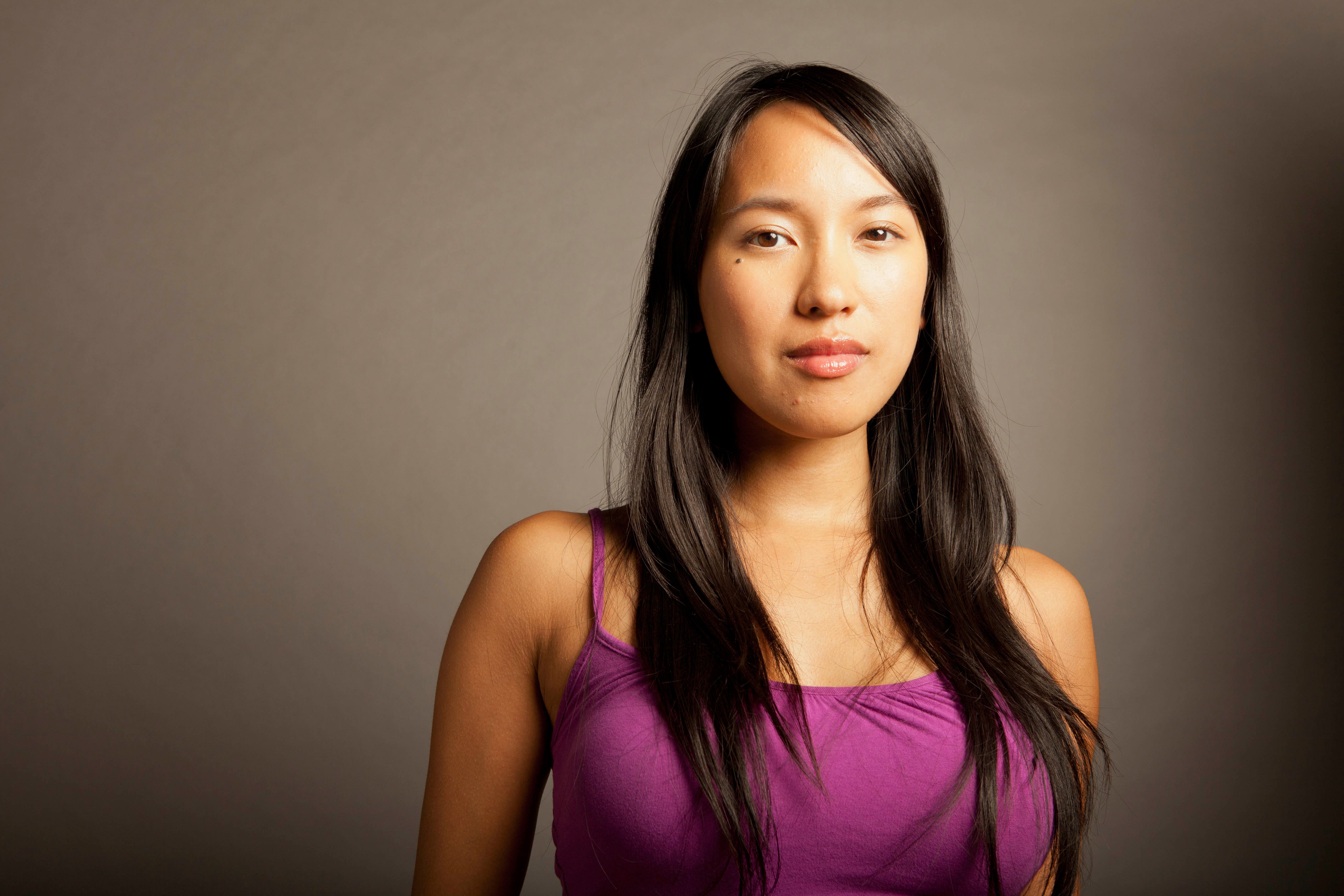
© David Zaitz
Again this image seems to suffer from a color cast issue as well. And like the previous image it also has a luminance problem, but here it’s more that the highlights on her forehead are a bit too bright.
We’ll begin by creating the usual 2 Curves Adjustment Layers. (I made an Action for this as it’s something I find myself doing on almost every image I work on. And in case you’re wondering, it doesn’t seem to matter which Adjustment Layer is on top.)
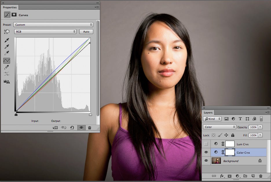
Here you can see the adjustments made were to add a little touch of Blue, mostly to the Mid-Tones. A little bit of Green and Red were also pulled out of the image, this time keeping most of the effect to the 1/4 tones, (highlights).
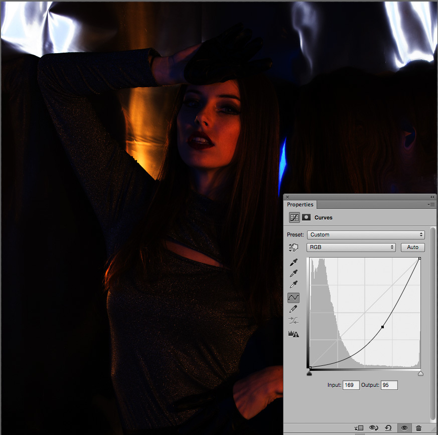
Next we’ll adjust the tonality of the image with our Lum Crvs. This time we’ll just pull down on a point about 1/4 of the way from the upper right corner to bring the tones in the highlights on her forehead back.
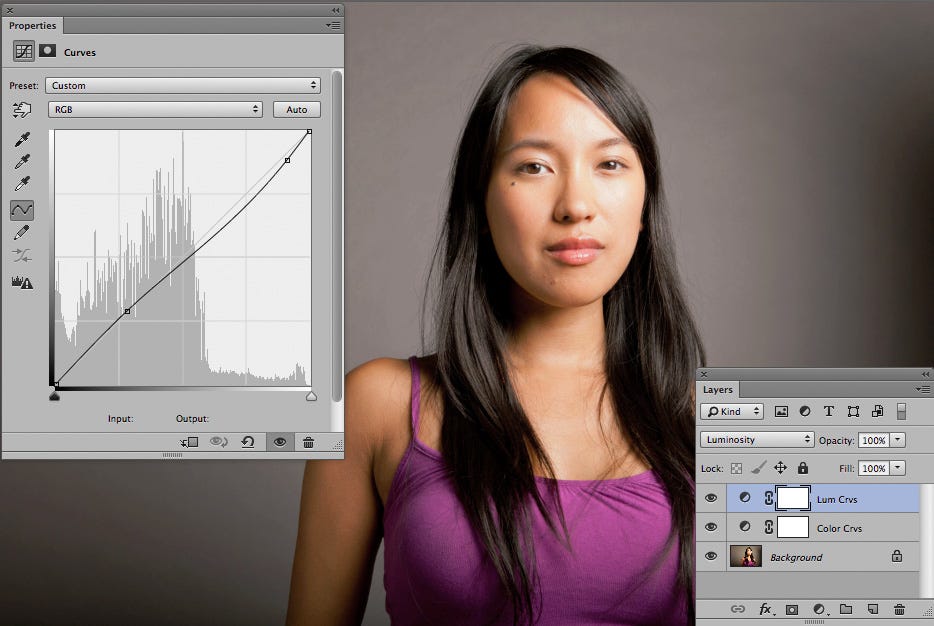
Notice the point that was added towards the bottom of the Curve? That was added to make sure this adjustment did not make the 3/4 tones, or shadows, darker as we don’t want to lose any detail in her dark hair.
Again by dividing up the tasks we’re able to quickly and easily improve the color and tonality of the image.
Just for a moment let’s go back and take a closer look at the adjustments made to the Color Crvs Layer.
Notice that the White Point of the RGB Master Curve has been pulled down a little? This move reflects another, very powerful aspect of this technique. When you have an Adjsutment Layer set to Color Blending you can also affect the Saturation of the image by adjusting the RGB Master Curve!
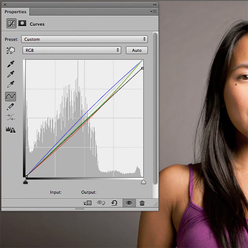
Here’s a close up of the Curves window so you can see the adjustments a bit easier.
Let’s dive a little deeper into this possibility. Below is the same image with the White Point of the RGB Master Curve pulled all the way down.
Now the image is completely de-Saturated. This is the same thing we’d get if we created a Hue Saturation Adjustment Layer and pulled the Saturation adjustment all the way to the left.
So pulling down on the White Point like this gives us an ability to tone down the Saturation without having to create an extra Adjustment Layer that could complicate our color correction efforts.
But simply de-Saturating an image may not be enough. What about those times when we need to boost the Saturation to make the image more colorful?
To better show just how this works I added a gradient just to the right of the girl and took about 50% of the Saturation out of it.
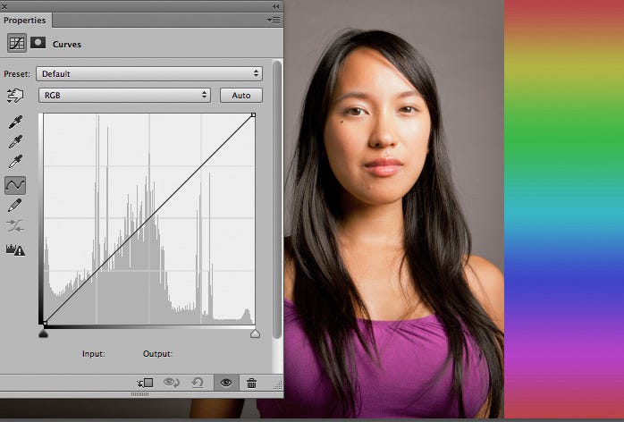
Adding Saturation with this technique is as easy as adding a contrast to the RGB Master Curve in our Color Crvs Adjustment Layer. Basically you just pull up on the 1/4 tones and down on the 3/4 tones like you see below.
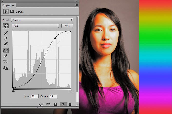
This Curve is called an “S-Curve” because of it’s resemblance to an S. The more extreme the adjustments made the more Saturation. The gentler the adjustment the gentler the Saturation boost.
Making a similar move to the Lum Crvs Layer adds Contrast to the luminosity of the image. (And pulling in the opposite way lowers the Contrast.)
Experimenting further with this technique shows that it’s also possible to adjust the Saturation of the Shadows or the Highlights differently, something that cannot be done with a simple Hue/Saturation Adjustment.
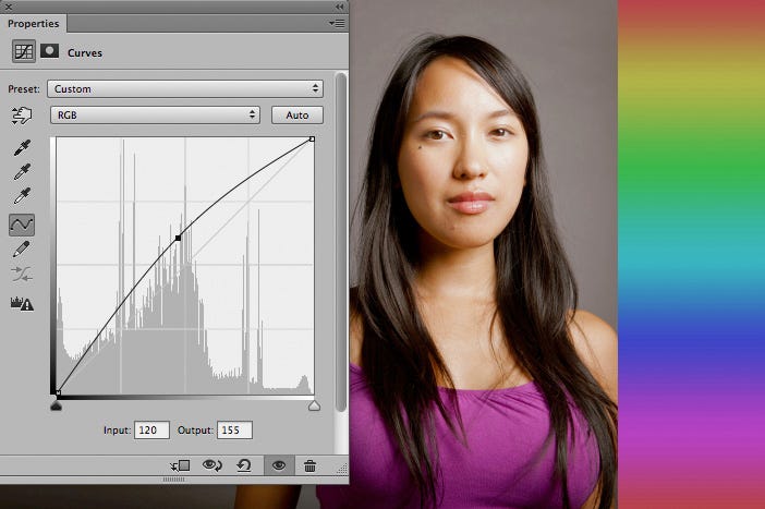
This part takes practice, but try pushing and pulling on the RGB Master Curve in different ways to see how you can get different effects. For instance in the image below you can see that pulling up on the middle of the RGB Master Curve de-Saturates the highlights while actually adding just a little more Saturation to the shadows.
And conversely pulling down on the middle of the RGB Master Curve add Saturation to the highlights while de-Saturating the shadows.
In the end this technique has a lot of power and the adjustments you make can be as simple as you want, or as sophisticated as you like.
By dividing the color correction tasks we not only find an easier way to get both better tonality and color, but we gain considerable power as well. Not bad, eh?