

Retouching Secrets of the Pros: Portrait Retouching Workflow
An outline on a solid commercial retouching workflow for portrait retouching.

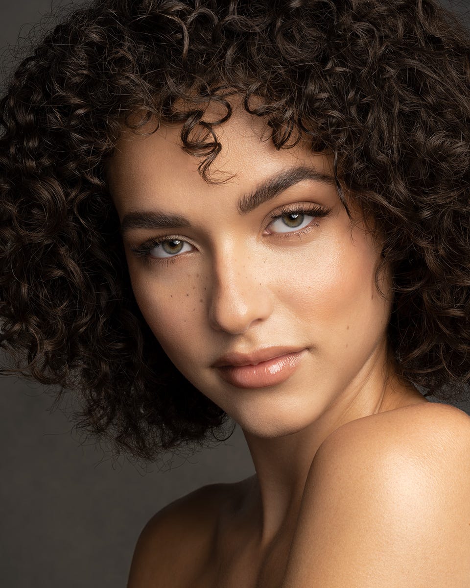
©Zach Sutton
Stephen Covey told us one of the habits of highly effective people is to ‘Begin with the end in mind”. When it comes to retouching portraits this advice has become my mantra.
Good retouching always starts with a vision of what the ultimate goal is for the image you’re working on. As commercial retouchers our job is to bring our clients’ vision to life and so every job starts with getting a clear idea of what the client wants.
Bringing that vision to life also requires having a good workflow that allows you to work efficiently and flexibly so you can dial your work in exactly how the client wants it.
And this means not only having good command of the tools, but making use of Layers so it can be easy to pull back, or even to push the effects of the Layers.
For instance suppose you have a Layer to lighten the lines around the eyes that are so common in portraits. In the images I work on I’ll usually have a Layer that completely removes these lines. But knowing that’s almost always much too strong I’ll slide the Opacity of that Layer down to say 50%.
Suppose the client decides we need to push a little more on those lines. All I need to do is boost the Opacity of that Layer up a little more and voila the client is happy.
Let’s take a look at a shortish outline of the workflow I’ve adopted for retouching Portraits. (Wow, can’t believe that sentence actually works… )
1) Make a Notes Layer: After opening the image in Photoshop give it a close look over and make some notes about what you might need to do. A Layer where you can use the Brush tool to mark up the things you see that really need to be addressed is a good first step.
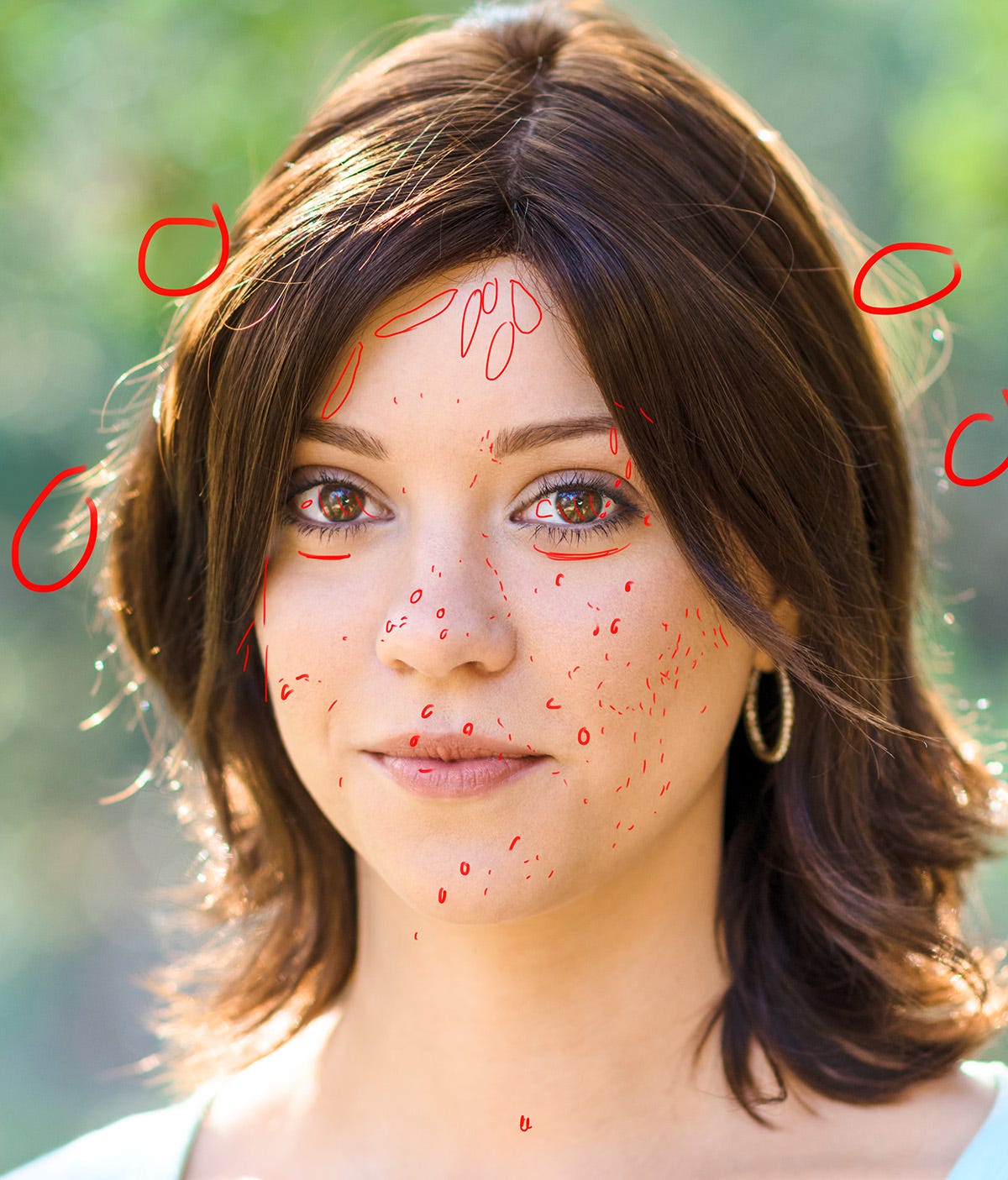
©George Simian.
The purpose for doing this is as much to make mental notes as much as actual notes. For me this ‘Notes’ layer serves as a reminder helping me make sure I cover everything that needs to be covered.
The best is when you get a marked up JPEG like this from your client so you can clearly see what they want addressed.
2) Retouch Layer: After looking over the image and making the Notes that will help guide the retouching the next Layer I make is one I call “Retouch”. This Layer is where I use the Spot Healing, the Healing Brush, and even the Clone Stamp tool to clean up everything that has to go. Dust specks, blemishes, stray hairs etc etc., basically anything that looks out of place and could be distracting to the viewer.
3) Lines Around the Eyes Layer: Aside from dust specks and all those distracting bits the lines around the eyes is an area that usually needs to be addressed. But how far to go in addressing these lines can be a big aesthetic decision. Working to remove them on a separate Layer makes it really easy to pull back on the strength so you can quickly get it “Just Right!”.
When working on areas like this it’s very important to remember precision is key. Using a smaller brush and taking a few moments to remove the lines while preserving the texture etc will give you a much better result than moving fast with a big brush.
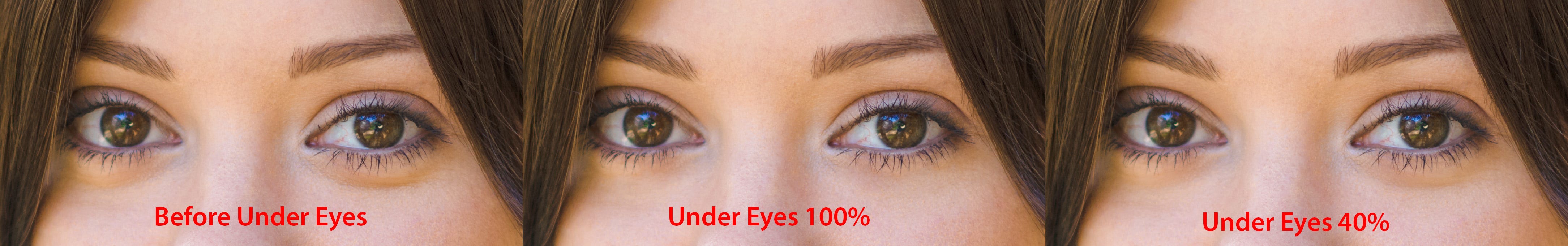
In the example above you can see how this worked, after completely removing the lines under the eyes I pulled the opacity of the layer down to 40% winding up with a result that compliments her face while giving me an easy way to push it further or pull it back as the client wishes.
4) Repeat This for other areas that need to be ‘Lightened’ but not removed, such as lines on the forehead, or around the mouth etc.
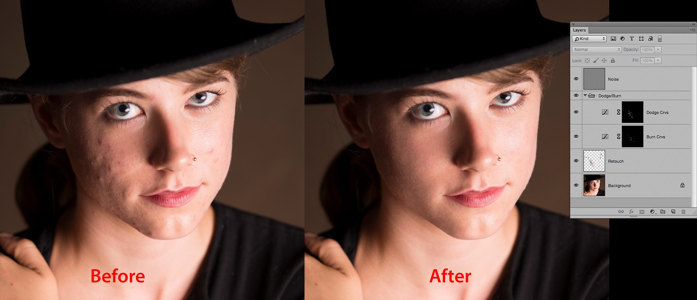
5) Dodge & Burn Layers: Imagine the skin is a seamless surface. It should have texture, (pores), but should otherwise fairly smooth. As the light skims across this surface it can exaggerate any unevenness making it look like the skin has lots of hills and valleys.
The goal with Dodging & Burning is to even out those hills and valleys while leaving the texture of the skin mostly alone. This is where I can get lost in the Zen of the work, but in truth this part can go quite quickly, especially if the model has good skin.
While there are many techniques for Dodging & Burning my preferred method is the ol’ reliable Two Curves technique. This is a pretty simple technique, but one that works really well.
Basically all you need to do is create 2 Curves Adjustment Layers. Pull up slightly on the middle point of the Curve on one to Dodge (Lighten) the image, and pull down about the same amount on the other to Burn (Darken) the image. Then fill the Layer mask for both of these Layers with Black to hide the effect. Finally name them Dodge & Burn, or something that will help you remember which one does what.
Now all you need to do is use the Brush tool to paint White in the Layer mask to Dodge, or Burn the image. When I do so I like to use a stylus and tablet such as a Xence labs, or Wacom tablet so I can make use of the pressure sensitivity of the Brush to finesse the effect.
When using the Brush to paint White it’s also really helpful to set the Flow setting for your Brush to a low value. The ‘Right’ Flow setting for you depends on how strong you make your Curve and how heavy a pressure you naturally use for your Brush strokes. I tend to make a pretty gentle adjustment on my Curves Layers and have a pretty light touch with the stylus so I’ll start off with around 10% Flow. But sometimes I dial that down as low as 2% when I really need to be gentle.
As you do your Dodging and Burning I find it helpful to think “Micro, Medium, Macro”. This means zoom in really close and work on the transitions between the pores etc, then zoom out a bit and work on the larger transitions, finally zoom out further to finish off the job. At each level you’ll see different transitions you need to address.
And if you feel you need to do more extensive Dodging & Burning than your Curves Layer allows all you need to do is duplicate that Layer, fill the Layer mask with Black and continue working. (Sometimes I’ll wind up with 3 or 4 Dodge Layers. For some reason I tend to do a lot more Dodging than Burning.)
Below is an example of what can be done with mostly Dodging & Burning from the book I co-authored with Katrin Eismann & Wayne Palmer, Photoshop Restoration & Retouching 4th Edition.
©Bobbi Lane
6) Color Correction/Color Grading: The last step is to adjust the color and tone of the image. Leaving this stage for the end makes it much easier to dial in exactly the look your client wants. Since the Retouching work sits under the Color work it will hold up if you ultimately make the image lighter/darker/warmer/cooler etc.
But if you do this step first then realize you made it too dark etc a lot of the work you just did retouching the image might need to be re-done. Saving this step for last allows you to more easily dial this in while not messing up any of the retouching work you’ve already done.
For Color Grading tips check out my previous article, Retouching Secrets of the Pros: Five Color Grading Tips Part One. In future articles I’ll also dive deeper into Color Correction techniques, so stay tuned!
When retouching I usually use a soft edged brush. But the most important part is watching to see how the results blend in. If you see mushy texture around the edges you either need to use a smaller brush, or try a harder edge with it.
If the edges blend well and the results look natural then you're doing it right.
What brush do you use for retouching
Soft or hard edge, any other brush option change? Thank u!